
Introduction
If you’re designing websites with dynamic content, understanding flexible components in Webflow can save you hours of work and simplify how your content adapts to real use cases. This isn’t just theory — Webflow recently released improvements that make components and CMS pages genuinely more adaptable, with less manual setup and smarter logic built into the design workflow.
In this guide, we’ll break down what these features are, how they work, and how you can use them to create site sections that truly flex with your content — whether you’re a designer, developer, or content editor.
What Does Flexible Mean in Webflow?
Flexible components are design pieces that adapt to changing content and scenarios without breaking layouts or requiring redesign every time something changes.
Earlier Webflow components were powerful, but they could be rigid when content varied widely. Now, with new dynamic features like improved conditional visibility and auto-suggested props, components can better respond to real content needs.
Key Updates That Make Flexibility Real
Here’s what Webflow has improved to make components and CMS pages more usable and adaptable:
1. Better Conditional Visibility
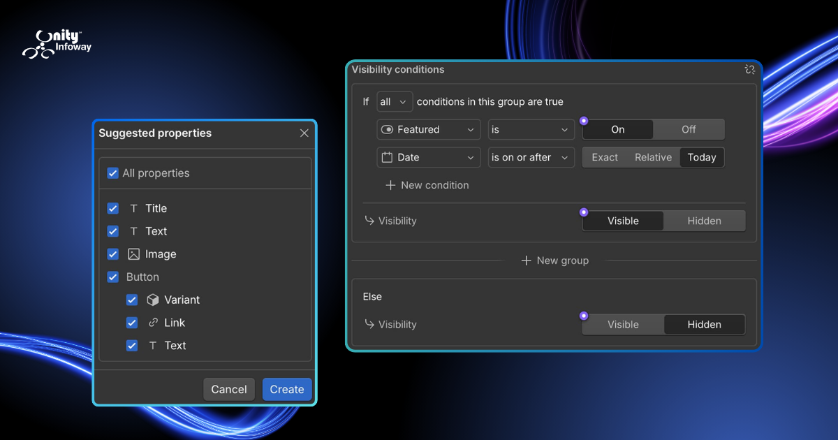
Conditional visibility lets you show or hide elements based on rules you set — like whether a CMS field has content, what locale is active, or even a specific prop’s value.
Before this update, setting up logic like “show this only if there’s a featured image” could be clunky or limited. Now it’s smoother and clearer to apply, making layouts that truly adapt — for example:
Hide a CTA button when the link is empty
Show an extra section only for specific posts
Display alternate copy based on locale
This reduces manual design work and stops editors from having to patch layouts every time content changes.
2. Suggested Props for Components
Props (properties) are connection points between a component’s design and the content or settings that change per instance. They let you expose specific parts of a component — like text, images, or links — so editors can update them without changing the layout.
With the updated workflow, Webflow now suggests props automatically when you create or edit a component, based on how elements are used. This reduces setup time and helps enforce patterns that work well across pages.
For example, if a component has a title and an image linked to a CMS field, Webflow will automatically recommend creating props for those fields — ready for use in any instance.
Benefits of Flexible Components in Webflow
Using these updated features gives you real benefits:
1. Faster Design and Setup
Suggested props speed up setup, especially with nested or complex components. You spend less time configuring and more time building.
2. Cleaner CMS Pages
Flexible components adapt to missing or varied content, so your CMS pages look consistent even when some content is unavailable or different lengths.
3. Fewer Layout Breaks
Conditional visibility helps avoid design breaks — like odd whitespace or unwanted elements showing up in the wrong context — which improves usability.
4. Better Collaboration Across Teams
Designers set the rules, and editors can update content safely without breaking design. This separation of roles makes teamwork smoother.
How to Build a Flexible Component Workflow in Webflow (Step-by-Step)
Below is a simple process you can follow:
Step 1: Plan Your CMS Content First
Before you create anything, think through:
What content will change?
Which fields might be empty?
What should be optional vs required?
Good CMS structure makes your flexible components work better.
Step 2: Build the Base Component
Start your component as a reusable block. Don’t hardcode content — leave space for props or dynamic CMS fields.
Step 3: Use Conditional Visibility
For any optional element, add rules so nothing breaks when content changes. For example:
Hide image container if there’s no image
Show alternate text when a field is blank
These conditions help your layout adapt — without you doing extra design work later.
Step 4: Accept Suggested Props
When Webflow suggests props, check them and accept. This lets every instance of the component get customized easily.
The recommended props may cover text fields, images, links, or even boolean values (true/false toggles like a switch for visibility).
Step 5: Connect CMS Fields
Once props are in place, link them to your CMS content. This makes the component truly dynamic — pulling data directly from your collections.
Common Mistakes to Avoid
Even with flexible components, some pitfalls remain:
Not planning for empty fields — leads to broken layouts.
Setting fixed sizes — auto layouts adapt much better.
Overcomplicating props — too many props can make editors confused.
Examples of Flexible Components in Real Webflow Sites
Here are some practical ideas where flexibility helps:
Hero Sections
A hero banner that shows:
optional subtext
an image or video
secondary button only if needed
Using conditional visibility keeps this clean.
Testimonial Blocks
When testimonials are missing photos or quotes, the layout still looks balanced and professional.
Product Grids
Products may have:
different numbers of features
optional badges
dynamic tags or pricing
Flexible components keep the grid even and consistent.
Conclusion
The updates to flexible components in Webflow go beyond small tweaks — they help you build CMS pages that adapt to real content needs with less manual effort. By using conditional visibility and suggested props, you can create reusable parts that work across your site, improve collaboration, and reduce maintenance time.
Whether you’re creating landing pages, blogs, or product collections, focusing on flexibility makes your Webflow workflow stronger and your sites easier to manage.
Try applying these flexible principles on your next Webflow project — and you’ll feel the difference right away.
1. What is a flexible component in Webflow?
It’s a reusable design block that adapts to different content and shows or hides elements based on rules you set.
2. How does conditional visibility help CMS pages?
It allows elements to appear only when there is matching content or logic, avoiding empty or broken sections.
3. What are suggested props in Webflow?
Webflow now automatically suggests properties to connect elements to dynamic content or settings, making components easier to set up.
4. Can flexible components save time?
Yes — they reduce setup and maintenance time by handling content variations automatically.
5. Do flexible components impact page performance?
No — built properly, they help keep your site cleaner without slowing it down.
6. Are flexible components easy for beginners?
With practice, yes — especially with suggested props simplifying setup.
7. What should I avoid when building flexible components?
Avoid fixed sizes, ignored empty fields, and unnecessary complexity in props.